UI design for SEO
- Apr 8, 2021 modified: Jun, 12 2026
UI design for SEO
Why is it important to incorporate UI design into your SEO?
User Interface Design (UI) affects the look of a site, the structure, the speed and the retention and action of visitors.
There is no one way to achieve SEO success. This article focusses on UI principles that will help SEO (Search Engine Optimisation).
UX design refers to the term "user experience design", while UI stands for "user interface design".
Often the terms are used interchangeably however there is a difference. Refer The difference between UX and UI design.
| UX | UI | |
|---|---|---|
| Application: | Physical and digital products | Digital products only |
| Focus: | The full experience from a user's first contact to the last | Visual touchpoints that allow users to interact with a product |
| Creates: | Structural design solutions for pain points that users encounter anywhere along their journey with the product | Combinations of typography, colour palettes, buttons, animations and imagery |
| Results In: | Products that delights users with their effectiveness | Products that delight users aesthetically |
Source: https://careerfoundry.com/en/blog/ux-design/the-difference-between-ux-and-ui-design-a-laymans-guide/
As a lecturer in User Interface Design at Griffith University Gold Coast 2000-2013 there were some User Interface Design principles that seemed to gel especially for non-designers. Where a designer may break rules, non designers should follow simple UI principles. Here are some interesting snippets.
Assumptions
We have to consider the web as a medium. A printed flyer may have 1400 dots per inch, a screen 72 dots per inch.
- 79 per cent of users scan a web page and do not read it.
- Reading from a screen is 25 per cent slower than reading from paper.
- Only 10 per cent of users actually scroll down a web page.
- Ten seconds is about the limit for a user's attention per page.
Source: GCCC Communication Guide Policy 31 March 2017
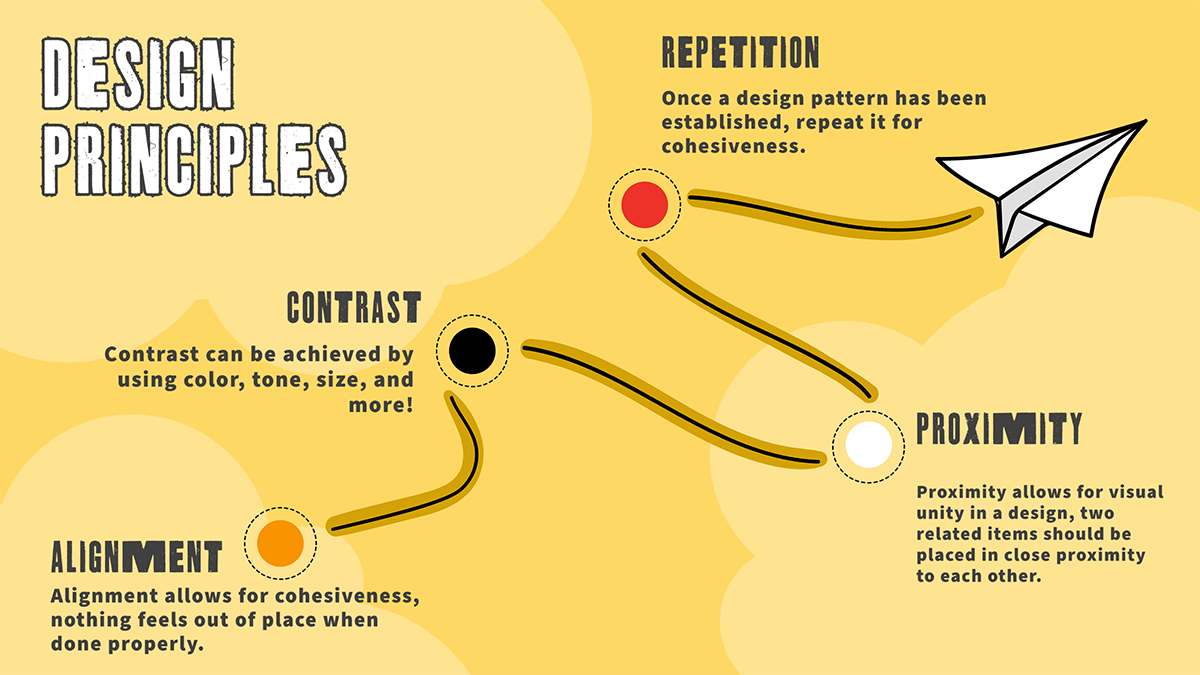
PARC
Proximity - associating a design element with another eg text near an image or a caption
Alignment - how an element is aligned for example consistently aligning left
Repitition - following consistent design rules
Contrast - use of contrasting elements to stand out
Affordance
Users should be able to perceive affordances without having to consider how to use the items. The obvious item here is a button, which affords clicking.
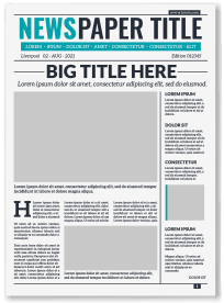
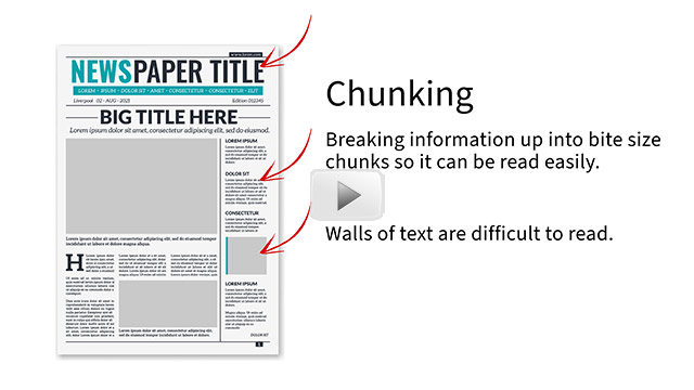
Chunking
Chunking relates to breaking information up into bite size chunks so it can be read easily - much like a newspaper. Arthur Miller asserted that humans can absorb +-5 pieces of information, Chunking allows information to be placed in digestible batches.
Gulf of Execution and Gulf of Evaluation
The terms gulf of execution and gulf of evaluation were introduced by usability researcher Donald Norman. They are concepts that are essential to understanding the interaction between humans and computers.
Gulf of execution is the degree of ease with which a user can understand the current state of a system. It is the difference between the intentions of the users and what the system allows them to do.
An example of a wide gulf is a door handle that is round and does not indicate if the door is locked or not.
Gulf of evaluation is the degree of ease with which a user can perceive and interpret whether or not the action they performed was successful.
Ecommerce Shopping carts and checkouts use shopping metaphors to help indicate a successful addition to your cart. Advanced forms on a website use validation to clearly indicate if a field has been entered incorrectly.
Source: https://www.educative.io/edpresso/gulf-of-execution-and-gulf-of-evaluation
Recognition - using icons to enhance perception
Visual perception is one of the most productive and quick ways through which people are able to obtain information and get it processed by the brain. Reading is simply slower and more work than perceiving an icon. Long forms that use icons make the task easier and seem less of a burden.
Whitespace
The simplicity of maintaining a sense of organisation with whitespace goes hand in hand with Chunking. In a long article it gives the reader a breather.
It does depend on the user, some people feel something is wrong if there is a lot of whitespace - "why is that spot empty".
Colour Schemes
Refer to our article Seeing Red over a can of Coke - understanding colour models and colour schemes. Why can we recognise the distinct colour of a coke can? How to create a good colour scheme. This is especially useful for non designers who may make poor colour choices.
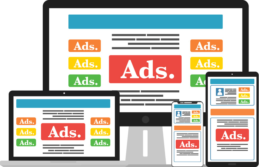
The User Experience to avoid
Think of the last time you clicked on a search that looked like it was a reasonable answer only to find-:
- A slow loading site
- ads popping up everywhere (as ads load the site jumps around)
- difficulty in navigation
- text across the full width of the page
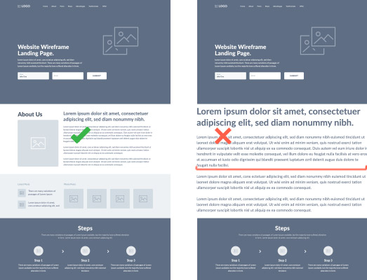
Text across the full width of a page is very hard to read. Often a sign of inexperienced or lazy web design.
If those ads are from Google they are hardly going to penalise the site in SEO terms, however the user (I know I do) may leave immediately giving you a high Bounce Rate.
When you choose to read a topic on a blog there are intrinsic rewards for making the reader stay, relax and enjoy the show.
UI plays a huge role in presenting information in a useable format.
How to measure UI success with Google Analytics
Google Analytics 4 is a shift towards more effectively measuring user experience and engagement.
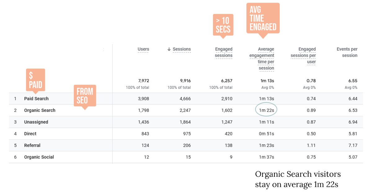
Notice the use of Average Time Engaged in a format that can be compared to different traffic sources. A site with poor usability eg pop-ups and text across the entire width of a page would typically have less engagement.
Tools and Techniques to improve Usability
My style of SEO is to develop support sites and to use my programming background to advantage. I want to use technical skills to outperform sites without that technical background behind them.
Here are some tools and techniques that can work.
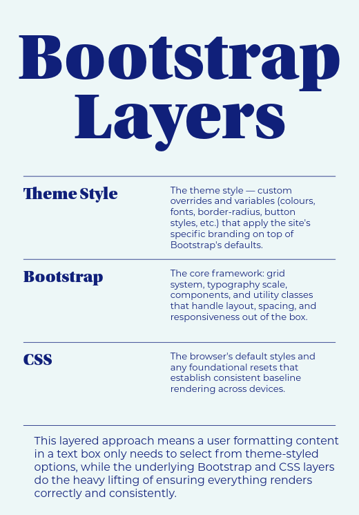
Bootstrap benefits to UI

Systems like Bootstrap are advantageous because they come with a certain core set of CSS instructions that you can build upon. The instructions are based on 12 column grids which adapt to different sized screens.
Your site can look good on any sized screen.
So rather than make every site with its own core set of design principles, Bootstrap allows consistency across many sites.
On top of the Bootstrap core code may be some more detailed instructions on the specific look for a site.
You can then develop a style of presenting information with transferable code snippets.
I use a nice web editor and a page full of presentation examples.
If you are looking to highlight a quote or setup a table of contents we spend the time getting some good examples and keep them handy.
Using Bootstrap as a non-coder
Recently a client was in my office and was delighted that they could format their blogs using Bootstrap. It turns out they had a Business degree, and had covered Bootstrap in the 1st year IT course Information Systems. There are advantages of Bootstrap underpinning a site when users are formatting news/blog content through text WYSIWYG editors (TinyMCE, Quill, CKEditor, etc.). The output looks polished and consistent without the user needing to know the underlying CSS code. The blogs do not endup looking too basic or a mismatched mess of font sizes and colours across different posts. Any tables, images, or embedded video the user drops into the blog body will inherit Bootstrap's responsive classes - it just works and looks good, adjusting to screen sizes. Normal users can now develop a blog and ask their favourite Ai app to format in Bootstrap 4 or 5 style, and its done. Bootstrap is theme-able meaning a site can have a distinct design style and typical Bootstrap formatting will adopt that style.
Harness Search data to inform site structure
You do not want a page for every search term or derivative. You can take advantage of Google's ability to understand context. Search engines are fantastic and understanding users intentions.
Our main Gold Coast SEO page is an example. It attempts to inform and certainly not irritate visitors.
That page then serves as the centre for many other pages related to SEO
Harness Search data to inform site structure is mentioned in 5 fundamentals of UX design that impact SEO.
Site Load Speed
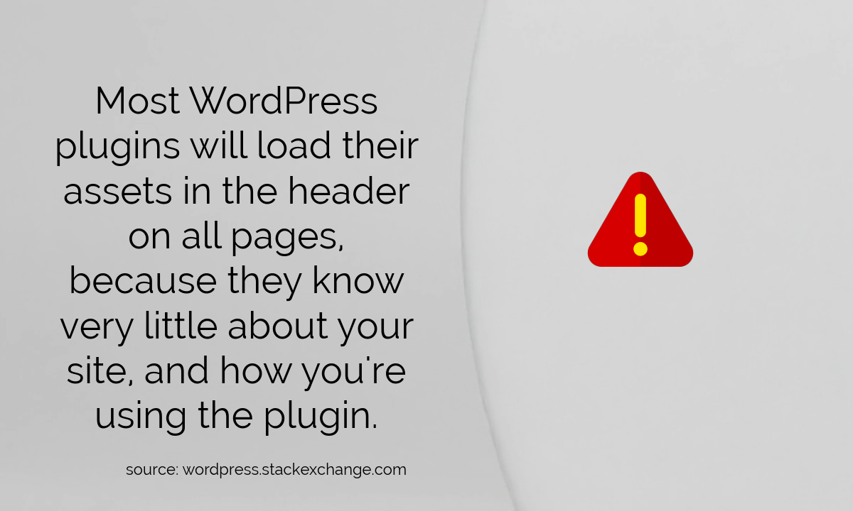
Many sites load every script required for the entire site on every page. That means if validation code is required on one page, it is available to all pages (even those that are not validating forms). Clearly not every page needs those scripts.
Many site optimisation metrics encourage minifying JavaScript but don't actually measure if the JavaScript was needed on the page in the first place.
Engagement Devices
Using programming and coding skills to create engagement devices helps maintain visitors interest. Or at least demonstrates that the site is slightly more than a low-tech brochure.
Creating a site that SEO's itself
Here is a secret (open secret) surfers spend most of their lives out of the water. When they are out of the water they consume vast amounts of screen time on surf videos and drooling over surf products.
Surfing has evolved from a surfer having one surfboard for over a year to some surfers having 40 boards (an extreme case). These are not pro surfers, these are guys who want to try different boards. The names of the boards give you an indication of how this has changed, "The puddle jumper", "The snub feeder".
A few of my surfing mates were looking for a way to sell their excess boards. We created FlickYourStick.com to sell 2nd hand boards for free.
The site is unique because surfboards cannot be easily added to a standard shopping cart system. Surfboards have unique dimensions (feet and inches). There are huge SEO gains in creating a site that can work with the logical keywords when searching for a board. This presents an opportunity for a multi-skilled SEO.
Even with sites like Gumtree and Facebook a site that is niched and easy to use would and does attract a lot of clicks just from the content provided by users. Often with SEO you are presenting unique content. With a site structure designed around users providing unique content the real challenge is to match the usability (UI) so that it will be used.
FlickYourStick.com is on of the sites that manufactures it's own SEO from the unique content provide by users. Developing eCommerce sites as an SEO has some advantages. We look at the product structure and use that to advantage in search. FlickYourStick.com does not earn any income, so let's not get too excited, but it does do very well against commercial surf shops on certain keywords.
Search News Articles...
Recent Articles

Does Instagram Boost SEO?
- Jun 02 2026
- /
- 105

The Growing Gap Between Coding and Engineering
- May 16 2026
- /
- 180
Have AI Agents Destroyed Social Media?
- May 05 2026
- /
- 261

Your IP Address and SEO
- Mar 06 2026
- /
- 544

Keywords no longer as visible in GSC
- Jan 12 2026
- /
- 1227

Unique Web Systems Matter in a World of Sameness
- Dec 26 2025
- /
- 840

Most AI Websites Fail to Rank
- Nov 18 2025
- /
- 1185

Sitemap.xml Best Practices
- Oct 14 2025
- /
- 4090

Fake Reviews on Google My Business
- Oct 07 2025
- /
- 1019

Sending Emails from Code
- Sep 17 2025
- /
- 1114
View All News Articles
Categories
A Gold Coast SEO and Web Developer