Do Strong CTAs Help or Hurt Your Website?

- Jul 31, 2025 modified: Feb, 19 2026
Do Strong CTAs Help or Hurt Your Website?
The Power of Persuasion: Do Strong CTAs Help or Hurt Your Website?
A CTA or a "Call to Action" is a prompt—usually a button or a line of text—that encourages users to take the next step. It's one of the most important tools in digital design, often determining whether a visitor bounces or converts.
But here's where the debate begins: should these CTAs be bold and commanding, or soft and subtle?
Some argue that strong CTAs drive engagement by being clear and assertive, while others believe that they can feel pushy, even manipulative, potentially driving users away. So, do strong CTAs help or hurt your website's effectiveness? Let's explore both sides.
The Case For Strong CTAs
There's a reason strong CTAs are so prevalent in digital marketing: they often work! Here are some of the proven reasons many designers and marketers swear by them.
They Encourage Immediate Action
Strong CTAs use direct, action-oriented language like "Sign Up Now," "Start Your Free Trial," or "Get 50% Off Today." These phrases create a sense of urgency and provide a clear directive, removing hesitation and leading users toward conversion. In competitive digital spaces, subtlety can mean missed opportunities.
They Eliminate Confusion
A well-placed, assertive CTA tells users exactly what to do next. Visitors often scan websites rather than reading every word, so a bold CTA acts as a visual and cognitive anchor. Without it, users might be left wondering, "What am I supposed to do here?"
They're Supported by Data
Numerous A/B tests have shown that tweaking a CTA's wording, color, or size can significantly increase conversion rates. For instance, one case study by HubSpot found that simply changing a CTA from "Download" to "Get Your Free Template" led to a 19% increase in clicks. Strong CTAs give users a compelling reason to act now, and the metrics often back it up.
They Leverage Psychological Triggers
Effective CTAs often tap into proven psychological principles—urgency ("limited time offer"), scarcity ("only 3 left"), or the fear of missing out (FOMO). These strategies, when used responsibly, can guide user behavior in a way that feels helpful rather than forceful.
While strong CTAs have clear advantages, they aren't without drawbacks. What works for one website or audience may backfire with another. Just because a CTA is bold doesn't mean it's effective. In fact, being too aggressive can lead to user fatigue, skepticism, or even distrust.
To gain a balanced perspective, let's examine the arguments against using strong CTAs more closely.
The Case Against Strong CTAs
Despite their effectiveness in driving clicks and conversions, strong CTAs can sometimes do more harm than good, especially when they are overused, poorly timed, or misaligned with user intent.
They Can Feel Pushy or Overbearing
Not all users respond well to direct commands. A CTA like "Buy Now" or "Don't Miss Out!" can come off as too aggressive, especially when paired with bright colors, pop-ups, or countdown timers. This can create a sales-y tone that some visitors find off-putting, particularly on informational or service-oriented websites where trust is critical.
They Risk Triggering User Skepticism
When CTAs are too strong, they may raise red flags. Today's users are more discerning: they've seen clickbait, scammy offers, and shady pop-ups before. An overly assertive CTA may be perceived as manipulative, leading users to hesitate, bounce, or question the site's credibility.
They Can Disrupt the User Experience
If a CTA feels out of place, is visually overpowering, or interrupts the natural flow of reading or browsing, it becomes a distraction. Pop-ups that demand immediate action before the user has had time to explore the content can frustrate rather than convert. Similarly, placing multiple CTAs on a single page can cause decision fatigue and confusion.
One Size Doesn't Fit All
Different websites serve different purposes, and not every platform benefits from hard-sell tactics. A bold CTA might be perfect for an e-commerce flash sale, but feels jarring on a mental health blog or a government service site. Tone, intent, and audience all matter, and misjudging any of them can backfire.
Context Matters
Not all call to actions are created equal.
Some strong CTAs work, and sometimes they don't. Their success largely depends on where, how, and to whom they are presented. Context is the secret ingredient that determines whether a strong CTA feels empowering or intrusive.
1 Audience Expectations
This plays a huge role. Understanding your users is critical. A tech-savvy audience might respond well to assertive CTAs like "Start Building now", while a more cautious or research-oriented audience might prefer gentler options like "Learn More" or "See How It Works".
Language should mirror the mindset of visitors, meeting them where they are in the decision-making process.
2 Industry and Website Type Matter
Certain industries lend themselves naturally to bold CTAs such as e-commerce, subscription services, and flash-sale platforms. These platforms often thrive on urgency and direct prompts.
However, sectors like healthcare, education, or legal services may benefit ore from empathetic, trust-building language. A site offering therapy services might turn users off with a CTA like "Book Now!', but may feel more approachable with a "Let's Talk" CTA>
3 The Stage of the Funnel Should Guide Tone
Where the user is in the customer journey should influence how strong your CTA should be. Visitors at the top of the funnel (those who are just exploring your brand) may prefer soft CTAs like "Explore Services" or "Get the Guide".
Meanwhile, users who are ready to buy, sign up, or commit may need more decisive nudge, such as "Subscribe Now" or "Claim Your Free Trial".
4 Platform & Device Considerations
Strong CTAs may perform differently across desktop and mobile. On small screens, bold buttons and short copy are often necessary, but if they dominate the page they can really backfire.
Similarly, social media platforms often require a more conversational tone compared to the directness that works well on a product landing page.
Advanced Call-to-Action techniques for pop-ups
Filtering user behaviour, perhaps eliminating bots, detecting interest in a topic (a real user scrolls and pauses), detecting previous interest (without the use of cookies) and detecting location information can increase the effectiveness of your CTA.
Images in pop-ups have a higher conversion rate. Systems like Bootstrap can help place images consistently or appropriately whether a desktop or a mobile phone.
Everyone is interested in a special deal, directed at them. Especially if it is a product or topic of interest.
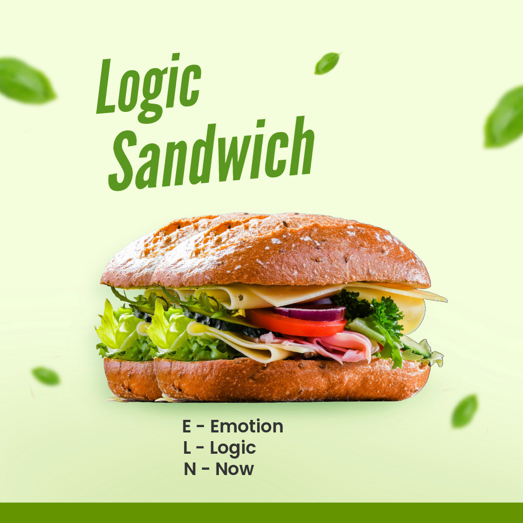
Logic Sandwich
E Emotion
L Logic
N Now
The logic sandwich surrounds logic in 2 emotive prompts. The theory is people buy on emotion then justify with logic. The 'Now' usually gives a reason to act now.
Final Takeaways
Calls to action are an essential part of any website.
However, it is important to keep in mind that stronger doesn't always mean better.
While assertive CTAs can boost conversions by being clear and compelling, they can also come across as pushy or out of place if not aligned with the audience, content, or context.
The key here lies in balance.
Understanding your users, respecting their journey, and crafting CTAs that feel natural rather than forced. Don't default to that "hard sell" language. Rather, experiment with tone, timing, and placements. Test different approaches and gather feedback.
Ultimately, the most effective CTAs aren't just loud - they are smart, relevant, and user-centered.
Search News Articles...
Recent Articles

Does Instagram Boost SEO?
- Jun 02 2026
- /
- 129

The Growing Gap Between Coding and Engineering
- May 16 2026
- /
- 201
Have AI Agents Destroyed Social Media?
- May 05 2026
- /
- 286

Your IP Address and SEO
- Mar 06 2026
- /
- 561

Keywords no longer as visible in GSC
- Jan 12 2026
- /
- 1253

Unique Web Systems Matter in a World of Sameness
- Dec 26 2025
- /
- 857

Most AI Websites Fail to Rank
- Nov 18 2025
- /
- 1208
Sitemap.xml Best Practices
- Oct 14 2025
- /
- 4126

Fake Reviews on Google My Business
- Oct 07 2025
- /
- 1035

Sending Emails from Code
- Sep 17 2025
- /
- 1128
View All News Articles
Categories
A Gold Coast SEO and Web Developer